The color psychology in UI: Why Hiring a Specialist Matters
The color psychology in UI: Why Hiring a Specialist Matters
In digital products, color is more than an aesthetic choice, it is a powerful communication tool. It is in fact a language of UI design that most stakeholders fail to recognize in full. Often they just see the nice looking end result of a designer's work and fail to realize the often subconscious influence the color has had on the designer's work to ensure that the user has the best possible experience while using the digital ecosystem.
As the UI designer for your digital ecosystem, the choice of color will have a significant impact on your bottom line. It is not enough for the color to look good; it needs to create brand recognition instantly and foster trust to ensure that users stay on the digital ecosystem long enough to convert into a sale.
Using an effective color scheme can help increase brand recognition almost instantly, and get users to trust your website enough to stay on it longer and even convert. An inconsistent color scheme will create user confusion which results in user’s abandoning your site in search of another with less confusion.
With the masses of information that are presented to users on a daily basis, if your website appears to be too cluttered and does not appear to be consistent then it is highly likely that users will not spend time trying to work out your intentions and will leave your site in an instant.
Creating a highly converting color system is far from choosing the right colors and looking good. Creating high-converting color systems requires in-depth knowledge of human color psychology and data-driven best practices while also being aware of many constraints along the way, such as how different cultures perceive color and how colors can be perceived differently on different devices.
While hiring a UI designer can cost a lot at first and the designer has created only a few visually appealing interfaces that do not bring any value, there is also a huge potential of growing your product and bringing it to new heights.
This is why hiring a specialized UI Designer is worth the cost, because in the long run they can create high converting interfaces that help you grow and bring you measurable results. This article explores why color is the most powerful tool in your UX arsenal and how expert created color systems can help your product reach its full potential.
The Fundamentals Psychology of Color in UI
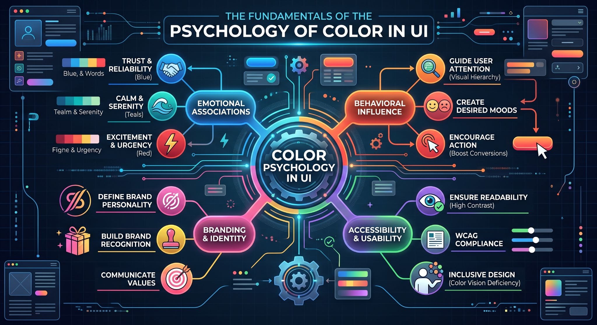
How Colors Influence Human Emotion and Decision-Making:
Physiological Effects of Warm vs. Cool Tones: Tones such as warm colors (Red, Orange and other colors of the Orange to Yellow sector) can increase the heart rate and can evoke sensations of urgentness and appetite and therefore can be a very powerful tool for CTA’s, in order to incite immediate action such as downloading, subscribing or purchasing.
Cool colors such as Blue, Green and Purple can have a lowering effect on the cognitive load and can also convey a sense of authority and can therefore be ideal for highly complex dashboards, for Financial UIs and for any other UI where the designers goal is to create a long term trust with their end users.
Cultural Contexts: Meaning of psychology of colors cannot be applied universally. Specialist designers understand that colors used in a design for an audience in North America might not have opposite or even repulsive meaning to audiences in other parts of the world. While white represents purity and cleanliness in the Western cultures, white is the traditional color of mourning in many Eastern cultures.
Designers should be aware that red represents danger or stop in error messages in the Western cultures but it means good luck in China and brings prosperity. Designers’ incorrect interpretation of these colors may alienate designers’ intended demographics.
Functional Color Usage: Colors are typically used by users to create mental shortcuts or rules for how they interact with applications. Designers must utilize colors in ways that reinforce users’ mental models for how colors are used to communicate. By deviating from time tested conventions of color usage creates cognitive friction and can hinder users from efficiently completing tasks. Rather, designers should strive to utilize colors in a manner that clearly communicates a function or status to a user instantly.
Case Studies of Successful (and Unsuccessful) Color Usage:
An amateur designer is different from a specialist mainly in that the specialist works with data and not with opinion. Instead of choosing brand colors by his or her personal preference, the tech brand designer chooses colors on the basis of their performance metrics.
For years designers debated over the optimal color for hyperlinks and CTAs on web sites. Google ran 41 shades of blue through a huge A/B test to see which color would garner the highest click-through rate. The end result, a specific blue, was worth millions of dollars in additional revenue for Google.
Many of the top performing SaaS companies even perform color tuning as their product and brand matures. They transition from extremely saturated experimental colors to more subdued yet highly accessible palettes as their brand grows.
The reason for this transition isn’t to make their product look cleaner but in order to ensure that the visual hierarchy is working effectively to highlight key functionality as the product grows feature by feature. This is because the designer understands that the color at play is a revenue generator and should therefore be tested, measured and fine-tuned to exacting perfection if it is to change (i.e. if the optimal shade of a button).
The Technical Challenges of UI Color Systems
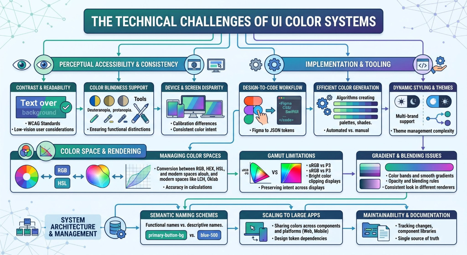
When choosing colors for a UI it’s not just about how they look, it can also have a psychological effect on users and how they feel when using a product. However, choosing the right colors and implementing them in a UI is an engineer’s job. A great color palette can look amazing on a designer’s high end monitor but quickly falter when put to use on lower end hardware and by users with different abilities.
Accessibility and Inclusivity (WCAG Compliance):
First, accessibility has become the biggest challenge in UI design today.Making sure that your interface should be accessible to as many people as possible. It is known by specialist designers that websites need to adhere to the Web Content Accessibility Guidelines (WCAG) in order to make sure that they are as accessible to people with as many disabilities as possible.
They can create high-contrast designs that are also really aesthetically-pleasing and do not have to compromise on style for the sake of other users with disabilities. Readers with limited visual capacity can read UI designs created by specialist designers even in poor lighting.
Humans experience one or another form of color blindness. Protanopia is the most common kind of color blindness, which means that an individual cannot see red light of long wavelengths and green light of medium wavelengths in relation to red light. After it comes Deuteranopia, meaning that an individual cannot see green light of medium wavelengths and red light of long wavelengths in relation to green light.
We have Tritanopia, which means that an individual cannot see blue light of short wavelengths and yellow light of long wavelengths in relation to blue light. When developing a UI interface, it is essential to keep in mind that a great part of the population around the globe will not be able to use the interface in case it is designed in such a way that it uses color in order to inform or guide the user.
Unlike regular designers who rely on color-only indicators (such as a red border for errors and a green border for successful actions), specialists implement redundant indicators such as patterns, icons, and plain text labels. By employing color-blind simulation software during the design process, the interface can be fully made accessible to users with special needs without even being an afterthought to create a better user experience.
Consistency Across Devices and Screen Types:
In the multi-device age we live in, it is imperative that the chosen color system should withstand. Color reproduction can be an easy thing to overlook. A bright and vivid blue on a top-notch OLED display could easily look dull and lifeless on an ordinary office-grade LCD screen. It can harm your brand’s perceived quality.
The development of the system-wide dark mode has complicated things even further. Color inversion is not always a good solution. It usually results in high contrast ratios and ghosting effects that are harmful to our eyes. While a typical UI designer simply treats dark mode as just another color system inversion, a specialized UI designer sees it differently, as an entirely new system to be designed with precision when it comes to adjusting luminance curves and saturation levels. Designers use so-called "design tokens"—named variables that guarantee the same colors, spacing, and font weight are used throughout your application—to avoid design drift.
These are just some technical challenges that make "eyeballing" the design a flawed idea. Any color system needs an approach that would consider both aesthetic requirements and engineering principles. Otherwise, it will fail to deliver a high-quality product.
Why Hiring a Specialist Matters
When it comes to product design in the digital age, intuition can be perilous without proper expertise. Where you might think all you need to create a great interface is "a good eye for design," in actuality, high-converting UI is a scientific field. Not only do you invest in visual attractiveness when choosing to hire a UI specialist, but also in its performance.
Informed by Data-Based Decisions
One distinguishing feature of a specialist is his or her ability to eliminate any kind of subjectivity. An amateur might opt for a certain color due to it "looking nice," while a professional uses this color knowing that it has been proven to guide the user's attention towards the right point.
Specialists use advanced analytics tools—such as heatmaps and eye-tracking studies— to figure out how your target audience interacts with your product. Specialists do not guess where the user will look next; they measure this very interaction, thus placing high-contrast "accent" colors in the right spots, attracting user's attention towards key elements of UI like "buy now" buttons or subscriptions.
This knowledge includes an understanding of the organization of the actual content as well. In the same way that we use visual hierarchy in this article via clearly marked headings, bulleted lists, and contrasting text fonts, a UI expert organizes your application in such a way that the eye of the user can follow easily. The expert understands that if a page is filled with clashing colors, then "visual noise" is created, overwhelming the user and increasing bounce rates dramatically.
Avoiding Common Pitfalls of DIY Design:
Building your UI design yourself is an illusion of cost-efficiency. It may seem like you’re saving some money upfront, but you’ll pay much more for it down the line. This approach can create two serious problems for further development of your product: color fatigue and design debt.
Color fatigue occurs when there is too much going on in your design and everything is trying to pull the user’s attention in a thousand different directions. Bright colors, and extreme contrast can be particularly offensive to the user’s eye and brain, causing them to eventually become blind to the information on the screen. This is akin to someone shouting at you down the street – at first it may get your attention but after a while you’ll tune the person out as they become white noise to your ears.
But even if you manage to get past the initially-overwhelming and often-failed attempt to design the UI yourself, the biggest problem is that you didn’t build it on top of a scalable foundation. Without a design system, you’ll rapidly amass design debt: a huge, tangled mess of code where the buttons are all slightly different shades of blue, the font weights are random, and growing the product out is a herculean task that keeps your developers up at night. A specialist designer builds a design with a solid foundation of design tokens: named variables for things like color, spacing, and typography. So that when you change the primary color in one place, it updates everywhere. This saves hundreds of hours of manual developer time, versus wrestling with a huge codebase of inconsistent UI.
Leveraging the GigMint AI Task Pipeline for Expert Matching:
The biggest challenge for many businesses is finding the right specialist and selecting the right freelancer in time. The GigMint AI Task Pipeline helps to filter and connect companies with the best freelance UI design talent. We connect businesses with the top 1% of the global pool of freelance designers who have the right specialization and also possess the required skills to create user interfaces that facilitate conversions.
No, GigMint is not just a marketplace to find freelance talent. We help businesses find a specialist. Vetting people for tasks takes a lot of time and most of the time there are lots of misconceptions about their skills and the task they can complete. The GigMint AI Task Pipeline makes all of this trouble go away.
The AI Task Pipeline for our freelance talent transforms rough branding concepts into a solid UI design project plan with well-defined deliverables. We can use our platform to get an accessibility audit, a design system for an entire application or even a single high-converting landing page. The AI Task Pipeline creates a solid UI design brief which is then matched with the correct freelance designer. The designer will then work on the project to meet the milestones and deliverables as defined in the brief. This allows you to focus on your product and GigMint will focus on finding the best talent for your project.
When you’re hiring a specialist for your UI design, you’re not just paying for a pretty picture to adorn your product. You’re paying for a framework of strategy to convert visitors to your site into die-hard customers. The right person, with the right tools, is your interface to your customers and converts for your company best.
How to Evaluate a UI Designer's Portfolio
Portfolio assessment is the key stage at which you begin to make your venture less risky. You will easily come across a beautifully designed Dribbble-style grid of mockups, but it won't tell you much about whether the designer can do something valuable for your business. To detect a specialist designer, you need to dig deeper than that beautiful render.
Identifying Depth in Color Strategy:
The portfolio of the specialist should be like a story, not just a picture gallery. While looking through the work of the designer, do not let yourself be dazzled by "visual candy," but look for the "why" instead.
A true UI expert will tell you what psychological sense lies behind his or her color selection. Why have they used a particular shade of blue as the main call to action? How does the color hierarchy ensure balance between user attention and the brand's visual identity? If the portfolio doesn’t contain this information, then most likely you are dealing with a newbie, whose main concern is aesthetics, not functionality.
Check whether there is evidence of high-level problem solving. Has the designer shown you some rough sketches, color mood boards, rejected designs? This is what makes a good professional who realizes that design is all about choice limitation grounded in user statistics.
Checking for UX-Focused Color Implementation:
The last but most important one is technical proficiency. You have to make sure that the designer sees colors as something functional rather than aesthetic only.
Start with checking if they mention accessibility issues anywhere. A portfolio which lacks information about WCAG or fails to provide examples of good high contrast design implementation is a bad sign. Check if they have any case studies in terms of inclusive design, such as working with color blindness or creating good palettes in light and dark mode.
What is more, look for examples of optimization based on real data. Do they talk about any A/B testing and its results? Do they demonstrate how they used data to optimize the color choice? Specialists always show "before and after" situations, when changing color tone or saturation helped them increase the metrics. When the designer focuses on the result of his work and not on how it looks, he proves that he understands the value of color for business development.
Summary
-
Summary of Benefits: Color Psychology is far from just being a "soft skill"; it is a crucial pillar of any successful digital product in today's environment. The truth is that color is a powerful tool of communication that determines whether your digital product will be considered to be a credible and trustworthy brand or a messy interface with little to no professionalism.
-
As opposed to simply making your product visually appealing, companies can use color psychology to help their customers navigate through their interfaces, encourage certain actions and establish credibility. By understanding the power of colors and using them strategically in the development process, businesses will be able to experience significant improvements:
-
Increased User Engagement: Effective color strategies allow for decreased cognitive load on users and make them stay on websites for longer periods of time.
-
Better Accessibility: The professional approach to implementing color systems allows companies to create digital products that meet all necessary WCAG requirements
-
Unwavering Brand Credibility: The consistent, data-driven use of colors creates a sense of trust almost immediately. The users will recognize a well-designed product as something done by a professional company, which is what builds up their trust in the long run.
The difference between a high converting experience and a poor one is all about the implementation. As we’ve already seen, to achieve such results, one needs more than to just choose a certain set of colors. It takes technical skills, knowledge of accessibility rules, and a data-driven approach to designing. Relying solely on intuition rather than data driven design can lead to costly mistakes.
Call action
Don’t risk your customers’ first impression of your brand. Your digital experience serves as the main way of communication with your customers, and it directly affects your profits. If you want your interface not only to look good but to work well too, you’ll need specialists who know the tricks of visual science
It would be the smartest move for you to quit making assumptions and hire professionals for exactness. Hire experienced, high-end UI specialists via GigMint.ai now. With the help of our innovative Task Pipeline powered by AI, we will find you the exact expertise that you need for turning your brand ideas into well-structured digital assets. No matter if you are creating your own software from scratch or trying to optimize your already created platform for better conversion rates – the right expert will make a whole difference for your product.
Investing in expert Ui design can help your product reach its full potential. Get connected with a professional via GigMint.ai.