The Importance of UX/UI Design in Building Software That Sells

The Importance of UX/UI Design in Building Software That Sells
The Modern Software Economy
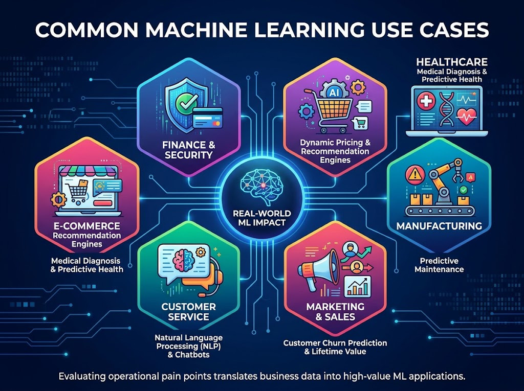
The bar for software has been significantly raised in recent years, particularly in a world where there is so much software available to download and use. It is no longer the simplest form of functionality enough to keep users engaged. Software has to look great and feel better, it has to feel so great that users are inspired to spread the word to friends, family, and even complete strangers.
While UI focuses on the interface and represents the physical aspect of User Experience, the visual elements of the application (buttons, graphics, color scheme, fonts and layout) – the core of UX is a strategic blueprint of a user’s journey. This strategy can be transferred into a physical interface and it is of utmost importance that UX/UI design work hand-in-hand to reach optimal results. The interface captures the user’s attention, the strategic design of the User Experience ensures a smooth journey through the application.
Design is the silent salesperson that enables users to find value in your software without any aid. By removing barriers to entry, building users’ trust and guiding them gently through the flow of using your software, design can convert a curious visitor into a committed user by removing the key points of friction that would otherwise cause users to abandon your software.
At its core, UX/UI design is not a cosmetic addition to a software product and must be considered early on in the development life cycle of a project. A company's software design strategy is often key in influencing all aspects of the customer lifecycle including first impression, user engagement and long-term advocacy. In an age of prolific
In today's crowded words software market, companies compete throgh superior design.
Influencing User Behavior
Mental Models and User Expectation
Users arrive at your software with prior mental models. This means that even if you’re the first software of its kind, users will have preconceived notions as to how your software should function. The location of the navigation menu or the Save button on previous software packages often function as familiar frameworks within which users navigate other applications.
Deviating too far from these expectations will inherently create cognitive friction within your user interface as users try to figure out the unfamiliar behaviors of your software. This is time wasted away from your value proposition. Intuitive UI is meant to create a bridge so seamless that it actually acts as a bridge to how your software actually functions and your users’ intuitive and often subconscious mental models of how software packages function. This will create an easy to use path to purchasing for your customers.
Cognitive Load and Hick’s Law
Marketers today rely heavily on choice as a primary tool in their arsenal. However, as you can probably tell from reading this far, excess choice can become a huge barrier to decision for your site visitors. As noted by Brian, choice creates paradoxes. Choices create more problems than they solve for your site. By applying Hick’s Law, you can begin to see how the number and complexity of choices affects time to decision.
You are supposed to maximize your conversion rates by optimising your interface to include as few choices as necessary. Use progressive disclosure, to disclose more information to customers as they need it. Get rid of excess noise on your site and be more focused within the conversion funnel by creating only as much choice as is required to reach each point of the funnel, allowing your customers to make easier choices as they click through your site.
The Hook and the Reward
Every software experience is of great value when properly utilizing color and typography to drive the appropriate emotions prior to a user conversion. There are many different design hooks used throughout user experience design but there is arguably one that’s the most important to incorporating successful end user experience and obtaining end user conversions, micro-interactions.
Adding animations and minor graphical effects to features such as clicking a button or filling out fields that progress as the user inputs data will immediately give users a positive experience throughout the software and also gives the user instant positive feedback that’s instantly recognized by end users throughout the software which will create a very positive experience that in the long run creates a very successful end user experience and allows for an overall very effective end user conversion process.
User Retention and Churn Reduction
Acquisition is only half the battle. The real work of growing a successful online business is retaining the users you worked so hard to get. While getting new users to convert initially was all about selling them on your product, keeping them as users long-term is all about delivering the real product to them. The work of UX design is to create a long term relationship with users to turn single purchase users into loyal subscribers.
Onboarding UX/UI Design
The battle for retention is typically won or lost within the first 90 seconds of a user’s time in your product. This 90 second period is referred to as the product’s Time to Value (TTV). The user has signed up for your product in 10-15 seconds and in the following 90 seconds they begin to garner value from the product. If they are confused or lost in the first 90 seconds, then clicking around in the interface to try to find value, then their churn risk skyrockets very quickly as they lose interest and become disenchanted with the product very quickly.
Onboarding is more than tutorials. Many enterprise software products have complex interfaces to which users need to get oriented. Interactive and contextual walkthroughs are better than static tutorials such as pre-recorded videos. These types of walkthroughs help users learn by doing and reinforce the key neural pathways to mastering software. By guiding users through to their first success — be it generating their first report or syncing their first project — users experience an immediate emotional return on investment that cements their attachment to your product.
Feature Adoption and Navigation Clarity
One of the most common causes of churn is feature blindness. It doesn’t matter how powerful and robust your application is, if your users can’t find the features that they are paying for then those features do not exist.
Designing for discoverability within your product requires a very focus driven approach when it comes to determining the highest value workflows to enable for your users. If your power users get stuck because your core features are buried under 3 levels of menus, and your new users get overwhelmed with the complexity of the interface then you have a problem that will result in churn. Finding the points of friction in your core money workflows and removing them as quickly as possible is key to reducing churn.
Feedback Loops and Iterative Improvement
The most successful products do not launch and then just sit there. They grow and change according to the user’s reality, if you want to prevent cancellation in your users, you have to set up feedback mechanisms like in-app-surveys, sentiment analysis or session-replays within your environment.
To stop your product falling victim to feature creep and increase in complexity, regular UX audits are crucial. Companies are trying to fight churn by adding more and more features to their products. However, this only increases the complexity and the cognitive load on your users even more. Use your feedback to trim the fat, to improve what is already there, and to develop a product roadmap that is aligned to your users’ needs and not to the developers’ ego. This way you can keep your UX as a living and breathing feedback loop and turn your software into a crucial part of your users’ daily work.
Conversion Rate Optimization (CRO) Through Technical Design
Conversion is not luck, it’s architecture. It’s the aesthetics of your website that bring users to the page and the technical design of the page that will keep them on the page long enough to convert. We work at the intersection of Conversion Rate Optimization (CRO) and engagement to ensure that your product is highly optimized to convert interested visitors into paying customers.
Reducing Friction in the Funnel
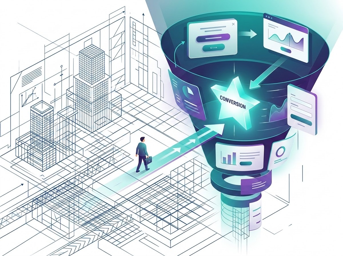
To keep users engaged with your software, you must respect their time and brain power. Study your sign-up process and your checkout process to see if there are places where you are asking for information that you do not need to collect. Progressive profiling is an effective way to collect more information about a user as that user moves through the stages of your relationship with that user. Limiting points of friction in your funnel, your process must be fully responsive.
Users start to abandon their shopping carts when they cannot continue from where they left off on another device. That means that your process must perform consistently across different form factors, and that your users’ progress through the process must be preserved between devices. Consistency across different devices is not simply a matter of making sure that the user interface looks similar on different screens. It is a matter of ensuring that users have the same experience regardless of the device they are using.
CTA Placement and Hierarchy
Following typical eye tracking patterns, users scan a page in an F-shaped pattern on mostly text pages and a Z-shaped pattern on hero-centric pages. By placing the primary Next Best Action along the natural scanning path, you greatly increase the chances that that action will be visible to the user. But placing the action on the page is only half the task of making it the user’s Next Best Action. The other half is making the action the most visible element on the page through contrast, sufficient whitespace, and color. When the action is the most visually prominent element on the page, then the user’s decision will be instantaneous.
Performance and Perceived Speed
There is a direct correlation between load times and bounce rates. Google’s Core Web Vitals for example, highlights the significant drop in conversions as a result of a one second delay.Technical optimization of your site for speed isn’t just about the back end code. It also has to manage the user’s perception of the speed at which the site is loading. When a site requires a lot of processing power to load, simple white pages of text that appear to be inactive are incredibly frustrating to users.
They can be enough to pull them out of the conversion flow. To get around this, designers use what are known as ‘skeleton screens’. These are gray, shimmering place holders for content that is yet to load that mirror the structure of the content that is being pulled in. The key function of these screens is to show the user that the system is working to load the content. They help to reduce user frustration by keeping them within the conversion flow.
The Visual Language of Authority
Trust is the most important currency in the digital market place. More important than any feature, any function or any price. First users judge the offer of a service or a software by their first impression of it. They check out whether they can trust this service or not with the data they want to put into it.
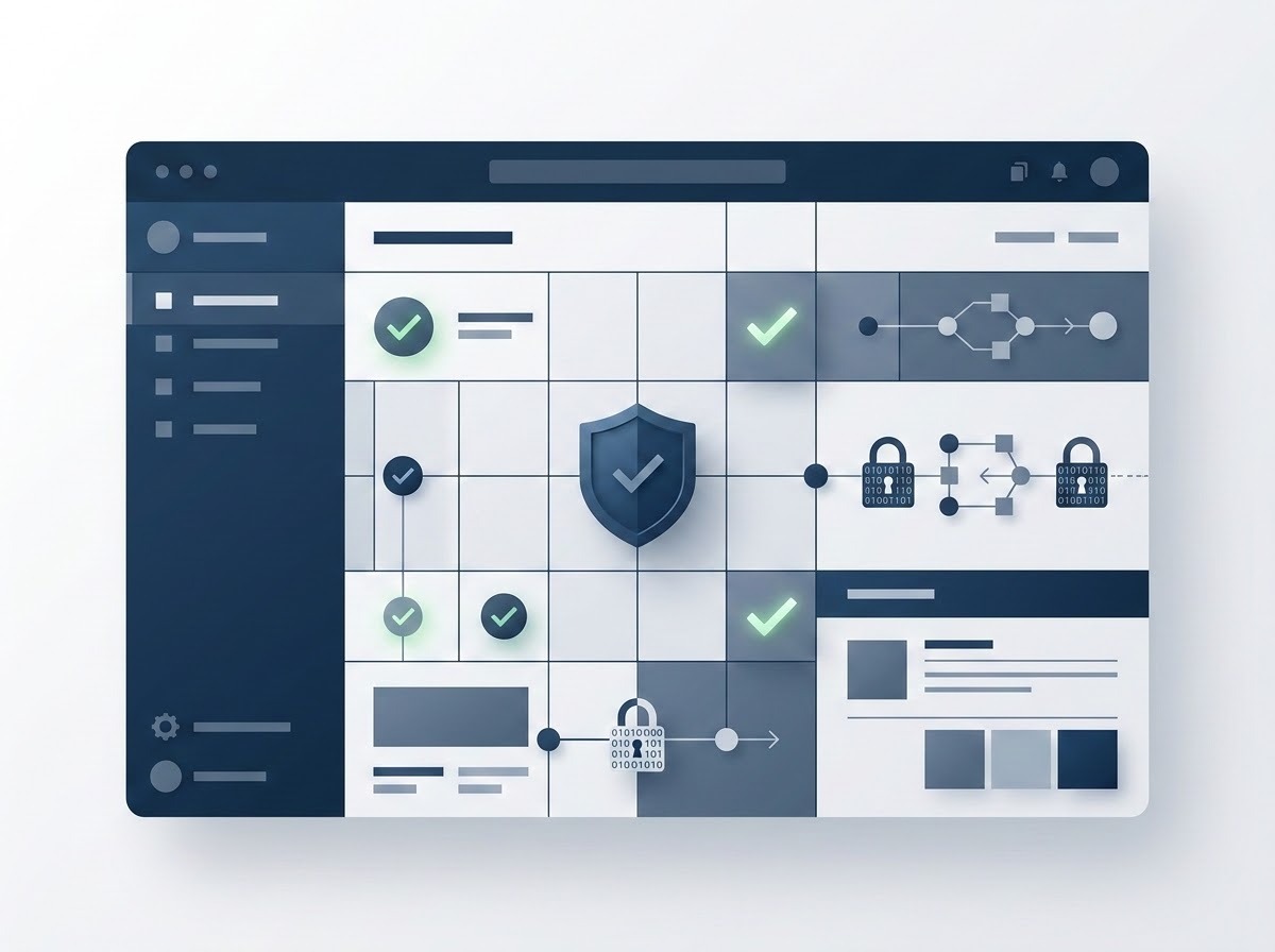
A non professional and unstructured looking software will for sure trigger distrust for the data the user wants to put into it as well as for the service around it. Creating trust is not about adding some fancy stuff to an offer. Creating trust is about building a visual language of trust and creating a first impression of professionalism and organization.
Consistency as a Trust Signal
A cohesive Design System is what lends a company professional authority. When all elements such as buttons, typography and spacing are used consistently across all screens, users immediately perceive a company to be stable and mature. Inconsistent UI on the other hand immediately triggers security anxiety.
Users perceive visual disarray of an interface to equal technical debt and a lack of oversight by a company. This causes users to step back from an interface that appears to be in disarray and can result in abandonment. Consistently upholding a company’s Design System with rigor is what gives users assurance that a company’s software has been built with the utmost care and precision.
Social Proof and Accessibility Integration
We need to ‘engineer’ trust, for example by placing Social Proof within the user journey at the points where users are making their purchasing decisions and where he or she will consider the purchasing decision being made with the particular company. The mere presence of such as Testimonials, large Client Logos and Security Certifications (such as those from Norton etc) create the impression that it is a company with great authority behind it.
Having such indicators of great credibility, are in themselves not enough. The business case for accessibility is vast as it opens up the market to a huge number of disabled people, and creates the perception that your company is an ethical one – that it’s a great company ‘to do business with’. Shows that a company really respects its customers in a way that no other aspect of a website can and thus engenders huge regard from them for that company, and that is one of the greatest indicators of a company of great quality.
Transparency and Navigation
One trap destroys trust forever. The trust we speak of is the one gained through transparency during the conversion process. This means that information regarding the price, data privacy, the application’s Terms of Service and more must be presented to users in a clear and organized manner and through a design that’s easy to read.
A logical navigation of a website has to be obvious. If users get “lost” while searching and are not able to get back to the start of the website they feel trapped. Users can feel forced into a conversion funnel when they have no other option to leave the site. Clear and organized navigation on the other hand will help users to feel in control, and thus more likely to use software.
Measuring the ROI UX/UI of Design
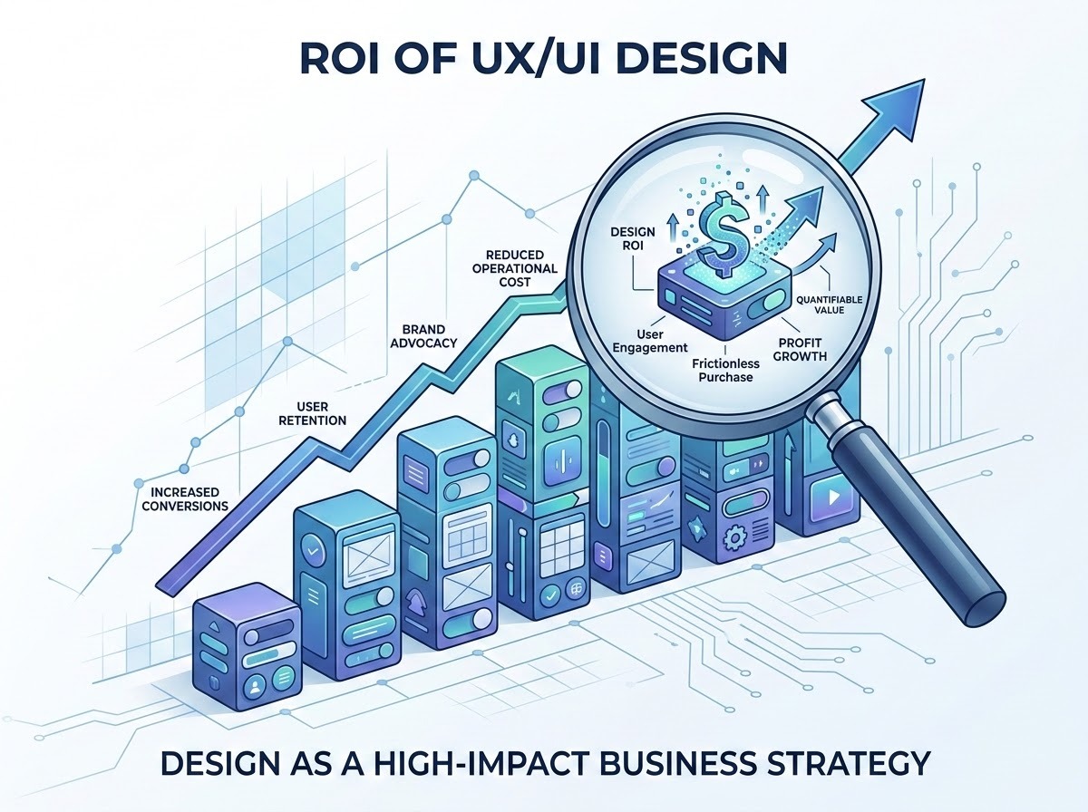
UX/UI design is far too often incorrectly treated as a cost center and viewed as an aesthetic “polish” that can be layered on once a product has been built. Design is, in reality, a high-impact business lever that must be quantified in order to build software that will drive profit and scalable growth.
Success Metrics Tracker
|
Metric |
Business Impact |
UX Correlation |
|---|---|---|
|
Customer Acquisition Cost (CAC) |
Lowering marketing spend |
Higher ad-to-app conversion |
|
Customer Lifetime Value (CLV) |
Increased profitability |
Higher retention/feature usage |
|
Net Promoter Score (NPS) |
Brand advocacy and referrals |
User satisfaction and delight |
|
Support Ticket Volume |
Operational cost reduction |
Intuitive UI/self-service design |
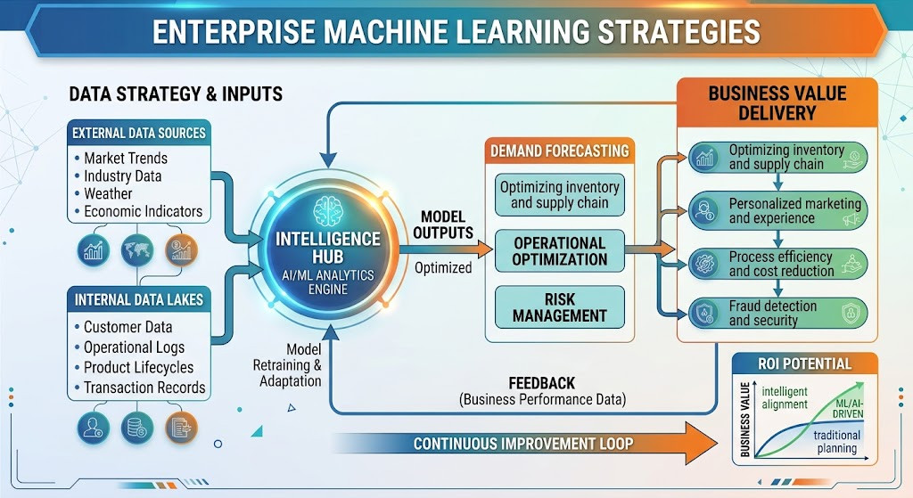
We measure our success in terms of ROI. For us, Customer Acquisition Cost (CAC) goes down as users have a frictionless purchase experience and ad-to-app conversion rates go up. Customer Lifetime Value (CLV) goes up as users continue to get value from the product and we retain them for longer than months. We also care a lot about Net Promoter Score (NPS) as it measures user delight and turns users into brand advocates. We also look at Support Ticket Volume as it’s a great proxy for how easy it is for users to self-serve and for us to operate as a company. As we grow our user base, we want to be able to do so without having to hire more people to support
Data-Driven Design Decisions
It can be hard to measure the ROI of design at first, but once you get to the point where you’re doing Data-Driven Design Decisions (DDD), then you can get really, really far in terms of growing your organization. Teams using DDD today leverage tools like heatmaps, session recordings and more to really understand where the points of friction are in a user’s journey, and then design to remove that friction.
By leveraging so much data, DDD teams can move from the feedback that designers and product managers receive from users on a daily basis to actual, actionable intelligence about their users. To take it to the next level, A/B testing experimentation – is the ultimate way to prove out the value of design.
Not only can you prove out minor UI tweaks against a control group, but you can actually quantify the additional conversion that you got as a result of that button redesign. Measuring design metrics will ultimately allow you to connect the creative work that designers are doing with the rest of the organization’s goals and strategies, thus proving that spending money on user experience is in fact spending money to make more money.
Technical Implementation and SEO Synergy
Modern SEO has moved beyond the days of using keywords in isolation of the user’s intentions, it has evolved into using the user’s experience as a key ranking signal in search. Google’s algorithm is now able to judge the quality of a user’s experience on a website and with the increased use of big data and machine learning, these signals are becoming more and more influential. User experience design, when done well, creates software that is capable of performing well in organic search results above and beyond its functionality on other channels.
When including strategic keywords in your design, it’s all about creating the most natural experience for users. Instead of forcing keywords in between sections of content and thinking that adding them will increase rankings for certain phrases, include targeted keywords in the following areas of design. Your Headings, your Navigation labels and your Call-to-actions.
One can't forget the technical elements of a web page such as meta tags, page titles and clean URL structures. These elements are not just code behind the scenes, they are also part of the user’s experience. A well-structured URL for example not only helps search engine crawlers to index pages quickly and efficiently, it also gives users a first impression of a well-organized and predictable website. These so-called ‘technical SEO’ elements are the skeleton upon which a great user experience can be built, and which search engines can use to discover it.
Investing in the Future of Product Growth
This article investigates the key points around UX/UI design – that sits at the intersection of technology, psychology, and business growth. The largest factor behind successful, long lasting, products is the Design behind the functional software, turned into a successful commercial product by aligned User Intuition, Data-lead Conversion Optimization and Accessible/Highest Performing experience.
Design is more than skin deep, and can no longer be an afterthought for businesses, as they battle to cut through in an overcrowded market place. It is a fundamental pillar to effective software development, and for those that treat it as such, it will unlock the ultimate competitive tool, software that truly sells. Invest in your users’ experience and watch your product growth take off.