Visualizing Data: Hiring Creatives to Make Your Analytics Pop
Visualizing Data: Hiring Creatives to Make Your Analytics Pop
I. The Era of Data Storytelling
In the contemporary business landscape, most companies collect more data than they can realistically analyze, making it difficult to identify the insights that matter. We have entered the era of "Data Overload," where the exponential growth of raw data has outpaced our collective ability to process it.
For many firms, this surplus of information does not lead to clarity but rather to "analysis paralysis." When decision-makers are confronted with vast, unrefined datasets, the path forward becomes obscured, and the momentum required for agile pivots is lost under the weight of sheer volume.
The root of this frustration often lies in the tools we rely on. Standard spreadsheets and basic bar charts, once the workhorses of corporate reporting, are increasingly insufficient for driving high-level strategy. These legacy formats excel at recording history but fail at illuminating the future. They provide the "what" without the "why," leaving critical correlations and emerging trends buried in rows of static cells. To move from observation to action, a more sophisticated approach is required.
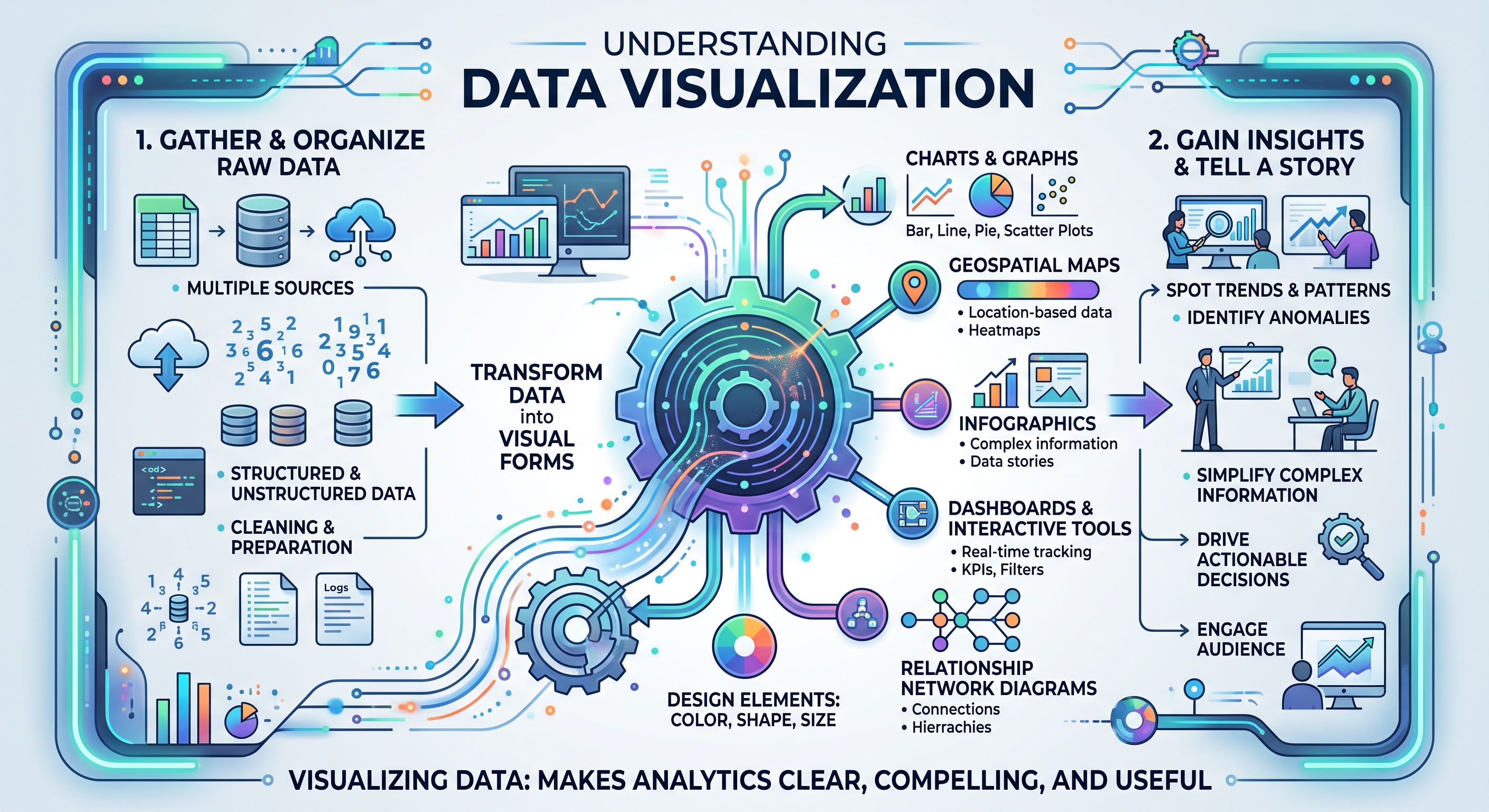
Presenting data as a story helps stakeholders understand what the numbers actually mean and what actions to take . This discipline exists at the vital intersection of rigorous analysis, intentional design, and compelling narrative. It is the art of translating cold numbers into a human language that resonates with stakeholders. By weaving data into a structured story, we provide the context necessary for understanding and the emotional resonance required for buy-in.
In the modern hyper-competitive landscape, the ability to visualize complex analytics is no longer a luxury or an aesthetic afterthought—it is a critical business competency. Those who can transform raw data into actionable insight will lead the market, while those who remain tethered to traditional reporting will find themselves left behind. Data storytelling is the bridge between information and impact.
II. The Business Case for Visual Analytics
The Hidden Cost of Bad Design
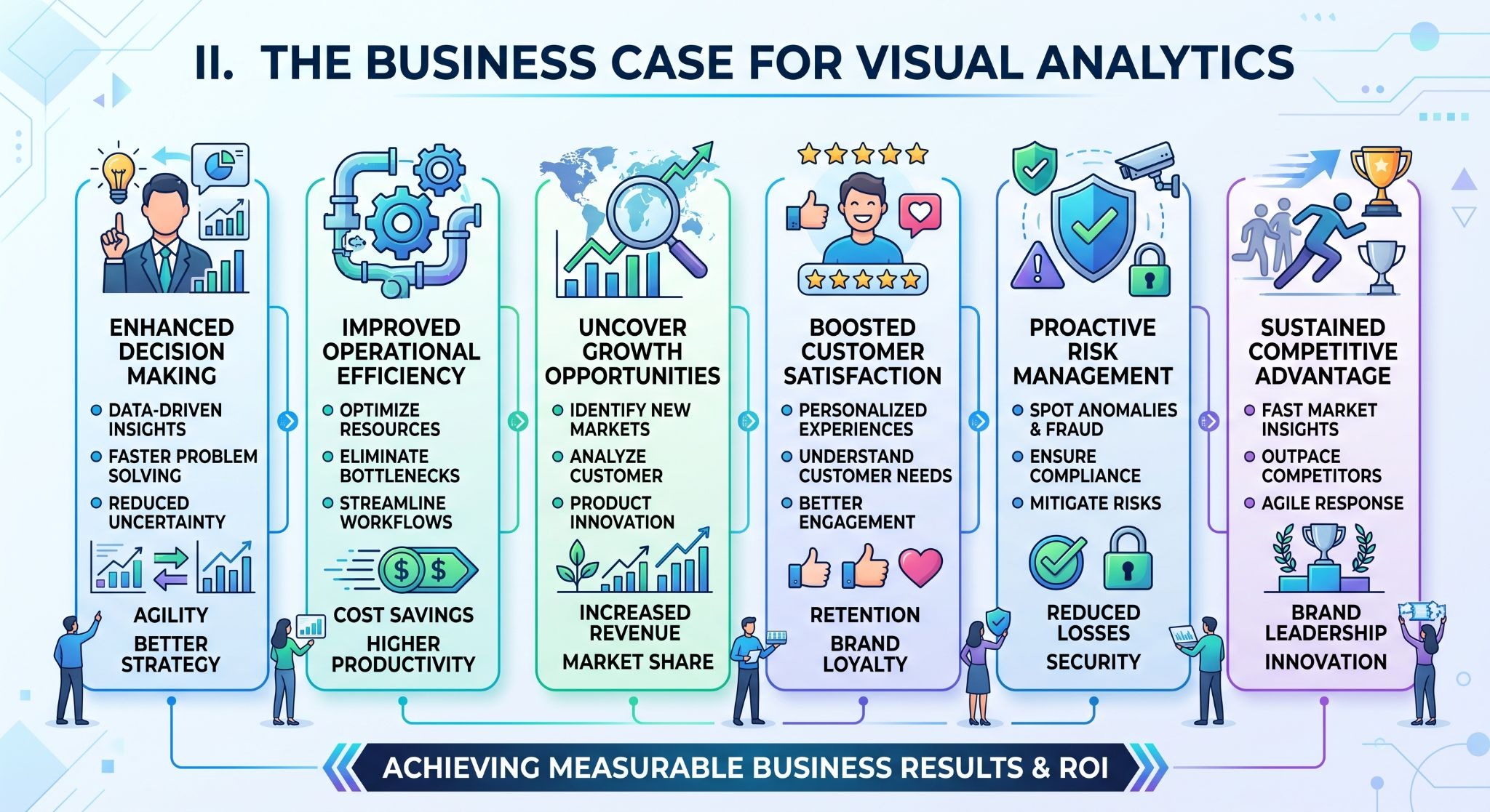
In the rush to distribute information, many organizations overlook the significant financial and operational drain caused by poor visualizing data. Bad design is not merely an aesthetic failure; it is a structural one that obscures the very insights it is meant to reveal. When graphs are cluttered, poorly labeled, or logically inconsistent, they create a "noise" that drowns out critical signals.
This leads to missed opportunities where teams fail to spot emerging market trends or vital correlations between datasets. These overlooked insights often represent the difference between proactive market leadership and reactive crisis management, carrying a hidden price tag that can manifest as lost revenue or inefficient resource allocation.
Beyond the loss of insight, poor design generates substantial "internal friction." In the corporate environment, time is the most precious commodity, yet countless hours are surrendered to meetings characterized by confusion rather than collaboration. When decision-makers are presented with indecipherable visuals, the meeting’s objective shifts from high-level strategy to basic interpretation.
Stakeholders spend their cognitive energy trying to decode what a specific axis represents or why a trend line seems contradictory. This friction stalls momentum, prevents agile pivoting, and creates a culture of frustration where data is viewed as a hurdle to be cleared rather than a tool to be leveraged.
Stakeholder Engagement and Persuasion
High-quality visual analytics serve as a powerful catalyst for organizational speed. The human brain is evolutionarily hardwired for visual processing; research suggests that we interpret visual cues up to 60,000 times faster than text. By leveraging professional design principles, organizations can transform dense, text-heavy reports into intuitive dashboards that allow for near-instantaneous comprehension.
This speed is a competitive advantage, enabling stakeholders to grasp the "story" of the data at a glance and move immediately toward informed action. When the path from observation to understanding is shortened, the entire enterprise becomes more responsive to change.
The business case for visual analytics is built on trust and persuasion. Aesthetic, transparent data representation does more than just look professional; it positions the information as a "single source of truth." When data is presented clearly and elegantly, it removes the suspicion that often accompanies confusing or "cherry-picked" statistics.
It creates a bridge of transparency between the analyst and the executive. This clarity is essential for building the emotional and intellectual buy-in required for strategic initiatives. By presenting data as a compelling, easy-to-understand narrative, leaders can align diverse stakeholders around a shared vision, turning cold analytics into the heat of collective action.
III. The Profile of a Top-Tier Data Visualizer
Identifying the ideal candidate to spearhead a data visualization initiative requires looking beyond a polished portfolio. A top-tier data visualizer is a multidisciplinary specialist, possessing a rare blend of technical rigor and creative intuition.
This profile begins with a deep proficiency in industry-standard tools—such as Tableau, PowerBI, and Google Data Studio—which serve as the foundational environments for most corporate reporting.
True experts often transcend these off-the-shelf solutions, leveraging specialized coding capabilities in D3.js to create bespoke, interactive experiences, or utilizing Python and R for complex statistical modeling and advanced plotting.
Their technical arsenal is further supported by a mastery of SQL, enabling them to query and manipulate large datasets at the source, ensuring that the visual output is as accurate as it is aesthetically pleasing.
Technical prowess is merely the baseline. The differentiator for elite talent is the mastery of narrative capability. This involves a profound understanding of UX/UI principles, specifically how they apply to the human brain’s cognitive load. A skilled visualizer knows that every unnecessary line, color, or label adds "mental friction" for the stakeholder.
By applying laws of proximity and continuity, they guide the viewer’s eye toward the most significant findings first. This is where information architecture becomes critical; it is not just about placing charts on a page, but about organizing data hierarchies so that the most important insights are immediately accessible. They design with the end-user in mind, ensuring that the dashboard or report functions as a logical, self-contained journey from inquiry to conclusion.
The most difficult attribute to vet for is the ability to bridge the "Vetting Gap." In the current market, it is easy to find a "chart-maker"—someone who can take a spreadsheet and generate a visually accurate graph. However, there is a vast chasm between a chart-maker and a "data storyteller." A chart-maker provides data; a storyteller provides actionable business insight.
The storyteller understands the underlying business context and the "why" behind the numbers, allowing them to highlight the specific correlations that drive strategy.
Distinguishing between these two profiles requires a rigorous screening process that evaluates not just the final visual product, but the candidate's logical process and their ability to translate complex analytics into a persuasive human narrative. It is this bridge between raw data and strategic impact that defines the highest echelon of creative talent.
IV. Navigating the Freelance Marketplace
Finding the right partner to execute complex data visualization projects is often the most significant hurdle for businesses. The freelance marketplace is vast, but it is also fraught with quality control issues.
When your strategy relies on high-stakes analytics, the traditional "post-and-pray" method of hiring is insufficient. This is where GigMint redefines the engagement model by focusing on curated quality rather than sheer volume.
The "GigMint Advantage" is built on the philosophy that top-tier output requires top-tier talent. Unlike open platforms where barriers to entry are low, GigMint maintains a rigorous vetting process where fewer than 1 in 100 applicants are accepted. This selective approach ensures that clients gain access to the top 1% of global creative talent.
Every expert undergoes a multi-stage screening that goes far beyond a resume review; we conduct strict evaluations of their technical skills, portfolio depth, and, perhaps most importantly, their professional reliability. By the time a freelancer is available for your project, they have already demonstrated the ability to deliver at the highest standard.
Beyond talent discovery, we recognize that enterprise collaboration requires enterprise-grade infrastructure. Financial safety is paramount, which is why GigMint utilizes a secure escrow system. Funds are held in reserve and only released when the client approves the work, eliminating the financial risk typically associated with independent contracting.
We facilitate seamless international collaboration by supporting rapid payouts via Stripe to freelancers in over 90 countries. This removes the administrative friction of cross-border payments, allowing teams to focus on the project rather than the paperwork.
Data security is non-negotiable in today’s environment. GigMint provides robust, SOC 2-compliant infrastructure, ensuring that your sensitive business information is protected with enterprise-grade security protocols.
By combining this level of trust, payment efficiency, and high-quality talent, GigMint bridges the gap between complex analytical needs and professional execution, providing a safe, predictable, and high-performing environment for your data storytelling initiatives.
V. From Complex Needs to Structured Briefs
One of the most persistent bottlenecks in the data visualization lifecycle is not the analysis itself, but the "Articulation Gap." Non-technical managers—those who understand the business implications of data but lack the vocabulary of data architecture—often find themselves in a linguistic stalemate with technical experts. Describing a complex requirement like "dynamic cohort analysis for multi-channel attribution" in plain language is inherently difficult.
When managers struggle to articulate these needs, the resulting project briefs are often vague, leading to "requirement creep," missed deadlines, and a final product that, while technically accurate, fails to solve the underlying business problem. This communication barrier creates a profound inefficiency that stalls digital transformation.
To dismantle this barrier, GigMint has developed the AI Task Pipeline, a sophisticated bridge between executive intent and technical execution. The core of this system is "Plain-Language Transformation." Instead of requiring managers to speak the dialect of SQL or D3.js, our AI-driven interface allows users to describe their project goals in conversational, high-level terms.
The system then parses these narratives, cross-referencing them against thousands of successful project outcomes to generate a detailed, structured brief. This process ensures that no critical technical requirement is overlooked, providing the freelancer with a precise roadmap from day one. By translating "business speak" into "builder speak," the AI Task Pipeline eliminates the ambiguity that traditionally plagues the start of a creative engagement.
The intelligence of the pipeline extends beyond simple translation into project governance through "Automated Milestone Generation." A common failure point in freelance engagements is the lack of structured accountability. The GigMint AI analyzes the complexity of the generated brief and automatically partitions the project into logical, manageable phases.
Each phase is assigned specific deliverables and verification criteria, ensuring that both the client and the creative partner remain aligned on progress. This automated structure provides a framework for accountability that is often missing in informal contracting, protecting the client's timeline and ensuring that payment is strictly tied to verifiable progress.
The pipeline concludes with "Intelligent Auto-Matching," a system that moves beyond simple keyword searches. Most marketplaces rely on self-reported skills, which can be unreliable.
GigMint’s AI evaluates the specific nuances of your structured brief—accounting for industry context, required toolsets, and preferred narrative style—and pairs the project with the top 1% of experts whose verified performance exactly matches those needs.
This is not just a search; it is a strategic alignment. By combining plain-language clarity, structured accountability, and precise talent matching, the AI Task Pipeline transforms the hiring process from a game of chance into a predictable, high-performance engine for data storytelling.
VI. A Step-by-Step Guide
The journey toward high-impact data storytelling begins with the transition from internal ambiguity to external clarity. The first phase, Project Definition & AI Briefing, leverages the GigMint AI Task Pipeline to bridge the "Articulation Gap." Instead of struggling with technical specifications, managers describe their strategic objectives in plain language.
The AI then meticulously parses these goals, cross-referencing them against global industry standards to construct a structured, comprehensive project brief. This ensures that every nuance—from data source compatibility to the specific interactive capabilities of a dashboard—is documented before the search for talent even begins.
Once the roadmap is established, the workflow moves into Browsing and Matching. This stage is characterized by precision rather than volume. Because GigMint has already filtered for the top 1% of global creative talent, clients aren't forced to sift through thousands of unverified resumes.
The platform’s intelligent matching system analyzes the structured brief and identifies specialists whose verified past performance and specific toolsets—whether in Tableau, D3.js, or advanced Python modeling—align perfectly with the project’s requirements. This curated approach transforms the hiring process from a time-consuming search into a strategic selection of the best-fit partner.
With the ideal partner identified, the engagement enters the Engagement and Escrow phase. Security and financial transparency are the hallmarks of this stage. To protect both the enterprise and the creative professional, GigMint utilizes a secure escrow system. The client initiates the contract by depositing the project funds into reserve.
This act signals total commitment and professional readiness, providing the freelancer with the confidence to dedicate their high-tier expertise to the project while ensuring the client’s capital is only released upon the successful completion of verifiable milestones.
The execution phase is defined by Iteration and Approval. This is where the narrative of the data truly takes shape. Guided by the automated milestone generation of the AI Task Pipeline, the project progresses through logical development stages.
This structure facilitates a collaborative feedback loop, allowing managers to review drafts, request refinements, and ensure the visual output remains tethered to the core business strategy. Throughout this process, GigMint’s 24/7 human support stands ready to mediate any complexities, ensuring that momentum is maintained and the final deliverable meets the highest standard of excellence.
Payout and Integration, represents the bridge from production to impact. Upon final approval of the deliverables, the escrowed funds are released, and GigMint facilitates rapid payouts to the freelancer—regardless of their location.
This seamless transition allows the organization to immediately integrate the new visual analytics into their decision-making framework. The end result is not just a completed project, but a transformed organizational capability where raw data has finally been converted into a persuasive, actionable narrative for strategic leadership.
VII. Accelerating Decision-Making
The return on investment for high-quality data design is frequently underestimated, yet it is one of the most significant levers for operational efficiency. When an organization moves beyond basic chart-making to intentional design, the ROI manifests not just in saved time, but in the velocity of decision-making.
At the forefront of this value is the reduction of "Time to Insight." In traditional reporting environments, decision-makers often spend valuable time interpreting static, cluttered reports rather than acting on them. A professionally designed, intuitive dashboard flips this dynamic.
By aligning visual hierarchy with the executive’s critical business questions, we shorten the gap between data exposure and strategic action. When an executive can grasp a complex trend at a glance, the organization gains agility—a tangible asset in any competitive market. Minutes saved on data interpretation aggregate into days of reclaimed productivity across leadership teams.
Beyond internal efficiency, great design delivers quantifiable external results. For marketing and customer-facing analytics, visual clarity directly impacts conversion rates. Users are more likely to engage with data that feels transparent, accessible, and credible. When complex marketing funnels are simplified into clear, interactive narratives, the customer’s journey becomes frictionless, increasing trust and ultimately driving higher conversion.
The long-term value of investing in design systems cannot be overstated. A one-off chart is an expense; a reusable design system is an asset. By establishing a library of standardized design components—color palettes, typography, and interaction patterns—organizations reduce future development costs and maintain consistency across all reporting.
This structural approach ensures that every new report benefits from the lessons learned in previous projects. In this way, design becomes a self-optimizing infrastructure that scales with the business, ensuring that your data storytelling capability remains a permanent, compounding advantage.
VIII. Raw Data to Actionable Insight
In an era defined by information overload, the bridge between raw data and strategic impact is storytelling. We have explored how high-quality visual analytics dismantle internal friction, accelerate decision-making, and build the trust necessary for organizational buy-in.
Transforming complex datasets into persuasive narratives is no longer an aesthetic luxury—it is a critical business competency. By leveraging the AI-driven precision and elite vetting of the GigMint marketplace, organizations can bypass the risks of traditional hiring. Don’t let your insights remain buried in spreadsheets. Starting for free on GigMint is the most efficient path to securing the vetted, high-tier creative talent required to turn your analytics into actionable influence.