The Complete Guide to Responsive Web Design for Better User Experience

The Complete Guide to Responsive Web Design for Better User Experience
I. Overview
Do you remember those times when you had to sit in front of your huge desktop computer and wait impatiently for your dial-up connection to load that highly structured website? The web has evolved dramatically over the past two decades. We live in the era of multiple screens—tiny smartphones that fit into your pocket, convenient tablets that you use during your commute and even huge 4K monitors in your office.
This shift has fundamentally changed user expectations. This diversity of devices has changed the requirements of users greatly. In particular, more than 55-60% of all internet traffic is created by mobile devices.
Despite these changes, many websites fail to provide a unified experience. Haven’t you been to that website where you see those tiny text and cannot read anything, where there are those buttons located too close and because of that you click on the wrong one and where those pictures get out of the screen? This fragment experience frustrates users and often leads them to abandon the site.
Users don't spend their time figuring out why something does not work properly; they just leave. It is a natural consequence of high bounce rates, low conversion and poor search engine ranking.
In order to address the above issue of digital fragmentation, the latest web architecture is built around the concept of Responsive Web Design (RWD). Developed by the designer Ethan Marcotte in 2010, RWD is a philosophy behind creating websites that would adapt their layout to look good on different devices and viewports.
Instead of developing a different codebase for every device that comes out on the market, responsive websites employ fluid grids, flexible images and CSS media queries in order to change its layout in accordance with the requirements of any viewport.
If you are a startup owner and would like to improve the conversion rates, a UI/UX designer working on improving your workflow or simply a developer trying to create a future proof infrastructure, then responsive design should be known to you. This article is going to walk you through the intricacies of responsive design.
This guide explains about the three key elements that make responsive web design possible, discover the advantages of this methodology compared to other approaches and get familiar with the connection between the responsive design and Core Web Vitals/SEO.
II. What is Responsive Web Design and Why Does It Matter?
The development of website layouts is akin to the exponential growth, diversification, and multiplication of consumer hardware devices within the last two decades. In the early days of the internet, websites would be built with fixed pixel dimensions that had been particularly designed for either an 800x600-pixel or a 1024x768-pixel desktop monitor.
In these times, web designers and developers found themselves working in an environment where the size of the screen was consistent and predictable, confined to the desktops and tables of offices and homes.
The sudden emergence of smartphones, small-sized tablets, and internet browsing on mobiles brought about mass hysteria among businesses to get their websites readable on these small screens, leading to the development of separate mobile sites such as the dreaded m.domain.com layout.
While such an isolated method did help address issues related to mobile viewing by delivering light-weight versions of websites to mobile users, it did lead to many operational issues for digital marketers and developers alike.
As two different and separate code bases had to be maintained for one website, this meant that each time there was any change in content, design or security, developers had to make the changes twice. Fragmented URLs, difficult redirections in case mobile users ended up on desktop pages by mistake and dilution of domain authority were some other challenges faced by businesses with this model.
Responsive Web Design (RWD) largely replaced this antiquated approach to designing and building the web by completely changing the fundamental philosophy of web engineering from one of narrow-minded, device-specific targeting to one of content flexibility for everyone, regardless of platform or screen size.
Where the old way of web development asked the shortsighted question of "What specific piece of hardware or specific brand is the person using to access my web content?"Responsive Web Design asks a more practical question of "How can I get this web content to mold to the space or screen real estate that the person is working with right now?"
The Comprehensive Business, Technical, and UX Case for RWD
A solid, responsive web structure is no longer an optional technical consideration but an essential ingredient in driving growth for all modern web platforms, applications, and systems such as gigmint.ai. The benefits range from the quality of the user experience through to savings in engineering effort right down to the very bottom line:
-
Unified Code Base, Technical Scalability, and Efficiency Maintenance of a unified code base revolutionizes how engineering teams work. No longer will the same updates need to be made twice in separate desktop and mobile codebases. Your engineering team makes one update, and it immediately and seamlessly applies to smartphones, tablets, laptops, ultra wides, and even future foldable computers. Not only does this mean less technical debt, but fewer opportunities for human error when deploying these changes, while increasing speed-to-market for new digital products.
-
Unified Brand Experience and Undying User Trust The fractured experience online creates instant user mistrust and damages the brand in the process. As users move smoothly from consuming content on their mobile phones while commuting to work to analyzing pricing plans and enterprise settings on high-quality displays after reaching their office workplace, the perception of the brand needs to be professional, unified, and highly reliable. Responsive design will not cause any visual inconsistency, broken images, and non-working functionalities, maintaining brand reputation and creating great user trust.
-
Correlation with Conversion Rates, Retention, and Revenue Friction is one of the greatest conversion killers in the current-day digital marketing environment. With no need for pinch and zoom to consume content, no misalignments of interactive buttons, no horizontal scrolling and layout changes – the user cognitive load will be kept remarkably low. Any kind of sign-up, check-out processes, onboarding procedures, and filling out complicated lead forms is done without any problem at all on any kind of device.
III. The Three Core Pillars of Responsive Web Design
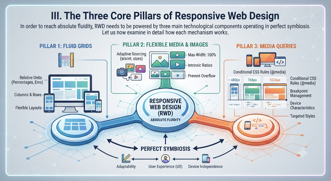
In order to reach absolute fluidity, RWD needs to be powered by three main technological components operating in perfect symbiosis. Let us now examine in detail how each mechanism works.
1. Fluid Grids
Up until recently, all web designs were coded using fixed $px$ values. RWD uses relative rather than absolute measures ($\%$, $em$, and $rem$), meaning that web page elements adjust accordingly depending on the width of their containing block and root font size.
Ethan Marcotte came up with a straightforward mathematical equation that enables one to transform a fixed design layout into a fluid grid:
$$\text{Target} \div \text{Context} = \text{Result}$$
Thus, if your target element (for instance, an article wrapper) is $600\text{px}$ in width and contained in a wrapper that has $960\text{px}$ width, you will divide $600$ by $960$ and get $0.625$. Your new width will be equal to 62.5%. As the screen dimensions change in size, your wrapper will always take up 62.5% of the parent element’s width.
2. Flexible Images and Media
While making sure that the grid is flexible is already a large step to optimizing websites for mobile devices, the media elements (images, videos, etc.) on websites still tend to be very stubborn. This is why an image with a fixed width of $800 ext{px}$ is a disaster on a $375 ext{px}$ wide smartphone screen. It then blows up the rest of the content on that screen and requires the user to scroll horizontally.
To prevent images from "blowing out" a site’s layout (i.e., making everything else move to the right, resulting in horizontal scrolling) while still allowing users to see the details of the images, developers add a simple global CSS declaration.
img, video, canvas {
max-width: 100%;
height: auto;
}
Images can be set to be 100% wide of their container, and to hold their original aspect ratio by adding height to be auto, by adding the following code to global CSS: img, video, canvas { max-width: 100%; height: auto; } Modern web architectures then also include HTML5 elements, with srcset attributes, for more advanced performance techniques. Such techniques allow for sites to be downloaded with lightweight mobile assets on smaller screens, and with high resolution (retina) assets on desktop screens with high resolution displays.
displays.
3. CSS Media Queries and Breakpoints
CSS media queries serve as the heart of responsive design since they enable you to specify CSS rules based on some criteria related to your viewport size.
@media (min-width: 768px) {
.sidebar {
display: block;
width: 30%;
}
}
Choosing the breakpoints should be done following modern principles of design, which do not involve designing for different devices. One shouldn't create a breakpoint for every new iPhone or tablet hitting the market. Instead, the developer needs to change the size of his/her window and place a breakpoint in those places where the content starts to look awkward. What is more, using the principle of Mobile First (min-width queries), one will make sure that small styles are downloaded first.
IV. Responsive Web Design vs. Alternative Approaches
With the development of digital ecosystems and changing user browsing behavior through endless numbers of devices, web designers and marketers have explored different ways to tackle multi-device design. The knowledge of how RWD can be compared to other approaches will give you insight into why it is a gold standard of web design and SEO.
1.Responsive Design vs. Adaptive Web Design (AWD)
Whereas responsive web design relies on a single and highly flexible fluid grid along with the use of dynamic CSS media queries which scale infinitely well in every possible viewport, adaptive web design (AWD) relies on a fragmented approach to the design process. This method determines the particular category of device used for access and loads a particular and static layout for that type of device (i.e., hardcoded layout for smartphone, tablet, and desktop). The Architectural Trade-off
Adaptive web design provides the developer the ability to determine the particular user experience to be delivered to that screen size. But it is by its very nature rigid. For example, if a user resizes his/her desktop browser horizontally, or if a non-standard device with unusual screen resolution accesses an adaptive website, the website either crashes, or its layout will snap abruptly.
With responsive design, all intermediate sizes and changes of window orientation, screen resizing are handled mathematically perfectly, and creates a more consistent user experience across devices.
2.Responsive versus Dedicated Mobile Sites (m. Subdomains)
Back in the days of early website creation, the prevailing approach was that of creating completely new websites on completely new subdomains, specifically those like "m.example.com". The SEO Nightmare: Google's push to mobile first indexing has made separate mobile subdomains a big disadvantage.
Handling redirections, coping with recurring duplicate content problems, and splitting of the equity from backlinks between two completely different URLs adds up to quite an amount of technical work for a web developer. What is more, users will often face the problem of broken redirects when they pass along links from mobile to desktop users. Responsive Web Design solves all of these issues by having a unified URL structure with all content, structured data, and metadata incorporated into it.
3.Responsive Web vs. Native Apps
For Mobile When designing digital products, decision makers always face the choice whether to spend considerable effort on building a responsive mobile web solution or to develop their native applications for iOS and Android app markets. Business and Technical Truths: Native applications are better when it comes to frequent usage, playing games in offline mode, or complex hardware integrations such as Bluetooth and complex camera handling.
At the same time, native applications add much friction as they need to be manually downloaded from app stores, they have separate code bases for iOS and Android and costly software development life cycles, updates, and maintenance. Finally, native apps are absolutely invisible to search engines’ spiders, which means that they do not get any organic search traffic from people looking for information on the Internet.
V. The Deep Connection Between RWD, UX, and SEO
The separation of the concept of user experience and technical development is outdated for the current era of search engines. Modern search engines, the user experience parameters affect the visibility and keyword ranking of websites on search engines. The algorithms of search engines are now built in such a way that they can measure the user experience of the website through the interaction of actual humans with the website. Efficiency of technical development and usability of interfaces is considered by search engines among the most important ranking signals.
-
Google’s Mobile First Indexing Google searches, indexes, and ranks your website contents based on the information extracted by the mobile smartphone crawler as the main yardstick. In case you have got a website which is desktop only and which hides some of the contents in the mobile view ports, then the search engines won’t be able to find your keywords, structured data, and the meta data, resulting in poor search engine rankings for your site. Having a responsive site means having identical content on all devices, and that tells search engines that your site is entirely optimized for mobile-first visitors.
2 .Core Web Vitals and Responsive Architecture The Core Web Vitals of Google are measurements that are directly tied to responsive web design. Optimization of these measurements is necessary in order to achieve high search ranking results:
-
Largest Contentful Paint (LCP): Measurement of loading speed and rendering capabilities. Optimal responsive design will ensure that low file size images and CSS render instantly on mobile devices, thus keeping the LCP below the optimal mark of $2.5$ seconds.
-
Interaction to Next Paint (INP): Measurement of interface responsiveness and latency. Good responsive design will not slow down the page because of heavy code and touch target problems.
-
Cumulative Layout Shift (CLS): Measurement of visual stability. The proper sizing of responsive containers will ensure that there will be no layout shift issues.
-
Behavioral Metrics in SEO As users come across a poorly designed mobile website that requires pinching, zooming, and horizontal scrolling, bounce rates increase significantly while the average duration of their visit decreases dramatically. Such behavioral metrics are considered by search engines as strong evidence for low quality and usability of the website’s content.
By removing all friction from the layout and providing a smooth experience across all devices, Responsive Web Design ensures a low bounce rate and high relevancy of the context.
VI. Best Practices and Advanced Techniques for Modern RWD
-
But knowing how to handle the basic responsive principles is just half of the story in the world of multiple devices. Contemporary web designers use advanced layout tools, built-in mathematical calculations for browsers, and new CSS techniques to create the most impressive digital experiences.
Variable Fonts with CSS clamp() Earlier media queries forced developers to set up rigid and manually crafted font-size changes for a lot of breakpoints, producing poor font scaling. The arrival of novel mathematical operations in CSS, such as clamp(), made flexible and automatic scaling of typefaces based on the actual viewport width possible. For instance,
$$h1 \{ font\text{-}size: clamp(1.8rem, 2.5vw + 1rem, 3.5rem); \}$$
This equation guarantees that all the headlines will neither become too small ($1.8\text{rem}$), nor will they be scaled appropriately on various screens ($2.5\text{vw} + 1\text{rem}$) and neither will they be too big ($3.5\text{rem}$).
-
Touch Targets and Ergonomics Interactions with mobile gadgets are based on the human finger rather than exact mouse pointer. Ergonomic and accessibility standards demand interactive elements, such as buttons, links, and input fields, to have a minimum interactive target area of $48 \times 48\text{px}$ with enough whitespace. This is a way to avoid unnecessary clicks and high bounce rates of mobile users.
-
Container Queries: The Future of RWD While standard media queries look at the total dimensions of the browser viewport, Container Queries analyze the dimensions of the particular parent element. This approach enables dynamic resizing of UI elements, cards, navigation modules, and sidebars depending on their location on the page rather than the screen size, providing unique possibilities of modular design.
-
Accessibility (a11y) Considerations The responsive layout should be entirely accessible. Availability of functionality of screen readers, keyboard focus, and color contrast mode regardless of the screen size makes the site compliant and ensures strong domain authority.
VII. Step-by-Step Implementation Framework
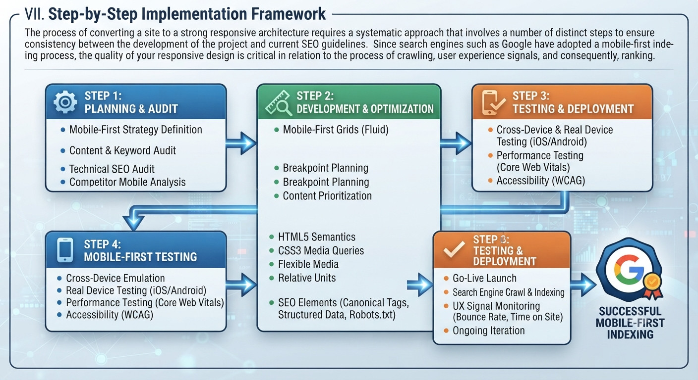
The process of converting a site to a strong responsive architecture requires a systematic approach that involves a number of distinct steps to ensure consistency between the development of the project and current SEO guidelines. Since search engines such as Google have adopted a mobile-first indexing process, the quality of your responsive design is critical in relation to the process of crawling, user experience signals, and consequently, ranking.
Phase 1: Audit of the Content and Wireframing Before writing any code, a thorough audit of your content hierarchy is vital. Identify the pieces of information that are critical for the mobile user and those that are not essential at all and therefore can be put aside or delayed. The search engine treats all the content available on various types of devices identically and does not need to penalize you for the use of hidden content if this practice is relevant for the user experience purposes.
Phase 2: Creating Mobile-First CSS Framework Develop your CSS code based on a foundation of a light weight mobile codebase. Begin with coding your base CSS for mobile views, followed by creating complicated grid layouts with multiple columns, higher resolution media files, and more navigational elements through the use of $min\text{-}width$ media queries as the screens increase in size.
This approach reduces any extra code from being created for mobile devices, ensuring that your page loads quickly enough to meet Core Web Vitals requirements—now essential ranking criteria for search algorithms.
Phase 3: Robust Testing Across Devices and Optimization Do not depend only on resizing of the desktop browser simulation to prove your responsive breakpoints. Conduct rigorous testing of your design across real iOS and Android devices, test the space between your touch targets to ensure there is no accidental mis-click, and conduct automated audits with the help of software such as Google Lighthouse and PageSpeed Insights.
Frequently Asked Questions
1. What Is Responsive Web Design?
Responsive web design (RWD) refers to the procedure where websites adapt automatically to the screen size of the device being used by the user. This can either be a computer screen or a mobile phone screen.
2. Why is responsive design vital for UX? It enables users to have easy navigation, clear reading of text, and quick page loading regardless of the device being used, which can improve user engagement and reduce bounce rates.
3. What is the difference between responsive design and mobile website design? The main difference lies in the use of separate URLs and codebases in the case of mobile website design.
4. Define CSS media queries. CSS media queries refer to CSS statements that set certain styles depending on device properties such as screen size, resolution, and orientation.
5. How do flexible grids influence layout design? Flexible grids use relative values instead of fixed pixels and make sure that elements resize in relation to their parent container.
6. Do responsive images help website performance? Serving oversized images to small mobile screens will waste bandwidth and loading time.
7. How does responsive design impact SEO? Mobile usability is one of Google’s ranking factors and it is easier to crawl one responsive URL than multiple non-responsive URLs.
8. What’s the difference between mobile first and desktop first design? In mobile first design, the page layout is designed from smaller screens and scaled up to larger screens while in desktop first it’s the opposite.
9. Can my current website be made responsive? Most existing websites can be made responsive by updating your CSS stylesheets for flexible grid layouts, fluid images and using media queries.
10. What are some tools available for testing for responsiveness? You could use the developer tools of your web browser such as Google Chrome’s developer tools or even emulators online
VIII. Future Outlook
Responsive web design has now become the go-to approach for making websites that work well on both smartphones, tablets, laptops, desktops, and future devices. Responsive web design allows businesses to build sites that are faster and easier to access as well as easy to maintain.
In addition to being more user-friendly, responsive web design gives a website better chances of performing better when it comes to SEO and Core Web Vitals due to mobile optimization. This way, businesses can boost user engagement as well as their visibility in searches.